On March 23, 2019, "Let's Eat and Drink While There is Oil in the Lantern" was unveiled to the public for the first time. A gathering of family and friends were at the event. It was there that I handed over the reigns to the piece to its new owner. A good time was had by all.
Saturday, March 23, 2019
Saturday, March 2, 2019
"Let's Eat and Drink While There Is Oil in the Lantern"
This piece is inspired by medieval reenactment. It shows two people at The Estrella War, an annual event in Arizona, where people gather to practice armored combat, and the arts and sciences related to the Middle Ages. The event is sponsored by the Society for Creative Anachronism (SCA).
This piece shows two old friends back at camp, cooking, and the camaraderie and brotherhood at the event.
Progress over time:
Session 1
Session 2
Session 3
Session 4
Session 5
Session 6
Session 7
Session 8
Session 9
Session 10
Final
Monday, July 23, 2018
Sunday, June 17, 2018
"Mirror"
This is the first in my series inspired by the All Souls Procession, in Tucson, Arizona. The All Souls Procession, according to their website, "is an enormous community-created, non-commercial event to creatively honor and celebrate our dead." It is a parade of sorts where people dress up. In particular, many dress in the fashion of Dia de los Muertos, a Mexican holiday that also celebrates the dead that occurs around the same time. This piece shows someone putting on sugar skull makeup for The Procession, while looking in a mirror, hence the name: "Mirror."
Progress over time:
Session 1
Session 2
Session 3
Session 4
Session 5
Final
Labels:
all souls procession,
procession
Sunday, December 31, 2017
Thursday, October 26, 2017
Tuesday, October 24, 2017
Wednesday, July 12, 2017
Friday, June 16, 2017
Tuesday, May 16, 2017
Friday, May 5, 2017
Tuesday, April 11, 2017
Wednesday, September 7, 2016
Wednesday, July 13, 2016
Sunday, July 3, 2016
Tuesday, May 17, 2016
Friday, April 1, 2016
Friday, January 1, 2016
Tuesday, December 8, 2015
Monday, September 14, 2015
Wednesday, April 1, 2015
Saturday, March 14, 2015
Sunday, March 30, 2014
Saturday, March 8, 2014
"Creek Street"
Sunday, January 26, 2014
Saturday, October 5, 2013
"Encore"
Here is my new painting, a self portrait of me playing my oud to my dogs.
Here are the notes I've taken while painting it:
For session one, I started on the under-painting. I've been taught to always paint the most important things first, so I started with the face, and moved to the dogs. I used a mixture of transparent oxide brown cut with half again as much ultramarine blue. I wanted a neutral middle pigment balanced slightly toward warm.
For session two, I spent a lot of time working on the face. I broke my rule of using only transparents for the under-painting and broke out some whites. After the face, I did the chair and some shadows. I used subtle mixes of transparent oxide brown, ultramarine blue, and terra rosa to add nuances of warm and cool.
For session three, I worked on the oud, the wall, the floor, and added some color to the flesh tones. I tried something that I had not really done before. With transparent paint, sometimes it is hard to get a smooth tone. It can be rough, uneven, and sometimes gritty. I tried to mix some transparent white with my pigments where I did not want that unevenness. Transparent white is only semitransparent. It has some qualities of opaque paint but still lets what's underneath through. It was moderately successful.
Session four: I darkened up the overall painting with some glazes. I also did the rug. Finally, I added some strings to the oud. I did this by using a palette knife loaded with paint. I think the under-painting is done.
Session six, I did the dogs. In particular, the black dog, Murry, was painted witha mixture of transparent oxide red, alizarin crimson, and ultramarine blue as a mixed up black. The result was so black, though, that I had to add some to the darks in the rest of the painting so the dog did not stick out like a sore thumb.
Session seven, I worked on the back wall and the floor. I thought I was done, but now I notice a spot on the oud that needs some work. I'm going to sit on it a few days too and see if I see anything else.
Here are links showing the progress over time:
Session 1
Session 2
Session 3
Session 4
Session 5
Session 6
Session 7
Final
Here are the notes I've taken while painting it:
For session one, I started on the under-painting. I've been taught to always paint the most important things first, so I started with the face, and moved to the dogs. I used a mixture of transparent oxide brown cut with half again as much ultramarine blue. I wanted a neutral middle pigment balanced slightly toward warm.
For session two, I spent a lot of time working on the face. I broke my rule of using only transparents for the under-painting and broke out some whites. After the face, I did the chair and some shadows. I used subtle mixes of transparent oxide brown, ultramarine blue, and terra rosa to add nuances of warm and cool.
For session three, I worked on the oud, the wall, the floor, and added some color to the flesh tones. I tried something that I had not really done before. With transparent paint, sometimes it is hard to get a smooth tone. It can be rough, uneven, and sometimes gritty. I tried to mix some transparent white with my pigments where I did not want that unevenness. Transparent white is only semitransparent. It has some qualities of opaque paint but still lets what's underneath through. It was moderately successful.
Session four: I darkened up the overall painting with some glazes. I also did the rug. Finally, I added some strings to the oud. I did this by using a palette knife loaded with paint. I think the under-painting is done.
Session six, I did the dogs. In particular, the black dog, Murry, was painted witha mixture of transparent oxide red, alizarin crimson, and ultramarine blue as a mixed up black. The result was so black, though, that I had to add some to the darks in the rest of the painting so the dog did not stick out like a sore thumb.
Session seven, I worked on the back wall and the floor. I thought I was done, but now I notice a spot on the oud that needs some work. I'm going to sit on it a few days too and see if I see anything else.
Here are links showing the progress over time:
Session 1
Session 2
Session 3
Session 4
Session 5
Session 6
Session 7
Final
Saturday, September 7, 2013
Friday, August 16, 2013
Portrait Class
Here are the paintings I made in a portrait class at the Drawing Studio. This class used the direct painting method, where I am more of a indirect painter, so it was a stretch for me.
Thursday, August 1, 2013
Sunday, July 14, 2013
"Post Alley"
Here is my newest painting, a scene in Seattle's Post Alley.
Here are the notes I've taken while painting it:
Session one was a marathon session where I finished the entire under-painting. I wanted to stay loose. I used nothing but transparent pigments to complete it, which included terra rosa, transparent oxide brown, van dyke brown, ultramarine blue, and terre verte.
Session two, I filled in the sky, sidewalk, tables and chairs, and other areas with opaque paint. I really struggled with the sky. At one point it was too warm, then too cool, then some rainbow mixture of the two. I finally settled with what I wanted, some warm yellow overlaid with cool blues.
For session three, I worked on the back buildings, the tables and chairs, and foreground figures. The foreground figures I worked over and over again. I'm still not totally happy with them. They will have to do, though.
I think I might be done. I might sit on it a few days and see.
Here are links showing the progress over time:
Session 1
Session 2
Session 3
Final
Here are the notes I've taken while painting it:
Session one was a marathon session where I finished the entire under-painting. I wanted to stay loose. I used nothing but transparent pigments to complete it, which included terra rosa, transparent oxide brown, van dyke brown, ultramarine blue, and terre verte.
Session two, I filled in the sky, sidewalk, tables and chairs, and other areas with opaque paint. I really struggled with the sky. At one point it was too warm, then too cool, then some rainbow mixture of the two. I finally settled with what I wanted, some warm yellow overlaid with cool blues.
For session three, I worked on the back buildings, the tables and chairs, and foreground figures. The foreground figures I worked over and over again. I'm still not totally happy with them. They will have to do, though.
I think I might be done. I might sit on it a few days and see.
Here are links showing the progress over time:
Session 1
Session 2
Session 3
Final
Saturday, July 6, 2013
Friday, May 3, 2013
"Barrio Viejo"
Monday, April 29, 2013
"Hafla in the Outlands"
Here is my new painting. It is on a 48 x 36 inch canvas. Click to embiggen.
Here are the notes I've taken while painting it:
For session one, I started on the under-painting. Here I used a mixture of transparent oxide brown and ultramarine blue for the dark areas, and straight transparent oxide brown for the light areas. I started with the most important thing first, the accordion player. After that, I started filling in the dark areas, because there is so much of it. The under-painting will take a while to complete.
Session two, I started on the belly dancer. I added terra rosa to my palette of transparent pigments. The terra rosa really gives a warm glow to the flesh tones. I like this because they are supposed to be lit by fire. I think that that really works.
Session three: I filled is as much of the dark areas as I could. Should note that as a approached the torches, I used more transparent oxide brown, to give a warm glow to the dark areas.
For session four, I started on the drummers. Trying to get that right balance between my dark mixture, and the terra rosa was difficult. Some of it will have to be revisited.
Session six: the under-painting is done!
Session eight: It might be done. I'm going to sit on it for a bit.
Here are links to the images showing progress over time:
Session 1
Session 2
Session 3
Session 4
Session 5
Session 6
Session 7
Session 8
Final
Here are the notes I've taken while painting it:
For session one, I started on the under-painting. Here I used a mixture of transparent oxide brown and ultramarine blue for the dark areas, and straight transparent oxide brown for the light areas. I started with the most important thing first, the accordion player. After that, I started filling in the dark areas, because there is so much of it. The under-painting will take a while to complete.
Session two, I started on the belly dancer. I added terra rosa to my palette of transparent pigments. The terra rosa really gives a warm glow to the flesh tones. I like this because they are supposed to be lit by fire. I think that that really works.
Session three: I filled is as much of the dark areas as I could. Should note that as a approached the torches, I used more transparent oxide brown, to give a warm glow to the dark areas.
For session four, I started on the drummers. Trying to get that right balance between my dark mixture, and the terra rosa was difficult. Some of it will have to be revisited.
Session six: the under-painting is done!
Session eight: It might be done. I'm going to sit on it for a bit.
Here are links to the images showing progress over time:
Session 1
Session 2
Session 3
Session 4
Session 5
Session 6
Session 7
Session 8
Final
Sunday, March 17, 2013
Under-drawing
Friday, February 8, 2013
"Overlooked Flowers on Valentine's Day"
Why does everyone give roses for Valentine's Day? I think people should give more sunflowers. Therefore, I give you my latest painting.

Here are the notes I've taken while painting it:
For session one, I completed the under-painting using nothing but transparent pigments: ultramarine blue, transparent oxide brown, terra rosa, transparent gold ochre, and alizarin crimson. So far, I'm pretty happy with it.
For session 2, I did two things. First, I did the pitcher and bowl. I tried to use a mixture of warm and coll pigments to give them a richness. Second, I did the background, which was a mixture of permanent green, transparent oxide brown, sap green, titanium white, and ultramarine blue. I tried to mix it up there too, to give it a richness.
For session three, I did many things. First, I did the greenery, using permanent green medium, sap green, transparent oxide brown, and titanium white. Second, I did the sunflowers. This was using cadmium yellow light, cadmium yellow deep, cadmium red, and transparent oxide brown. Finally, I fixed the small purple flowers using alizarin crimson, titanium white, cadmium red, and ultramarine blue. Oh, and let's not forget the reflections and highlights. I think the painting might be done. I will sit on it and see.
Here are links to images showing progress over time:
Session 1
Session 2
Session 3
Final

Here are the notes I've taken while painting it:
For session one, I completed the under-painting using nothing but transparent pigments: ultramarine blue, transparent oxide brown, terra rosa, transparent gold ochre, and alizarin crimson. So far, I'm pretty happy with it.
For session 2, I did two things. First, I did the pitcher and bowl. I tried to use a mixture of warm and coll pigments to give them a richness. Second, I did the background, which was a mixture of permanent green, transparent oxide brown, sap green, titanium white, and ultramarine blue. I tried to mix it up there too, to give it a richness.
For session three, I did many things. First, I did the greenery, using permanent green medium, sap green, transparent oxide brown, and titanium white. Second, I did the sunflowers. This was using cadmium yellow light, cadmium yellow deep, cadmium red, and transparent oxide brown. Finally, I fixed the small purple flowers using alizarin crimson, titanium white, cadmium red, and ultramarine blue. Oh, and let's not forget the reflections and highlights. I think the painting might be done. I will sit on it and see.
Here are links to images showing progress over time:
Session 1
Session 2
Session 3
Final
Thursday, February 7, 2013
Wednesday, December 26, 2012
"La Rambla"
Here is my new painting, a scene from a street in Barcelona. It is in oil and on a 24 x 18 inch canvas.
Here are the notes I've taken while painting it:
My goal for this painting is to be very loose and free. It is not about detail, it is about indications. For session one, I laid in the under-painting. I debated whether or not even to do an under-painting, but I did after all. The whole thing was laid in in one session. People and figures are only indicated. The pigment used here is van dyke brown, which is between a cool brown and a warm gray.
For session two, I moved in with some color. For the shadows, I used a mixture of cobalt blue, alizarin crimson, van dyke brown, and titanium white. For the lights I used a mix of titanium white and naples yellow. The trees I did at the end and I'm not real satisfied with them.
For session three, I added some color to the background figures. Most of my time, however, was spent on the buildings in the background. I used a palette knife to add chunky paint. I'm not totally satisfied with it, but it will have to do. The painting is almost done.
Here are links to images showing progress over time:
Session 1
Session 2
Session 3
Final
Here are the notes I've taken while painting it:
My goal for this painting is to be very loose and free. It is not about detail, it is about indications. For session one, I laid in the under-painting. I debated whether or not even to do an under-painting, but I did after all. The whole thing was laid in in one session. People and figures are only indicated. The pigment used here is van dyke brown, which is between a cool brown and a warm gray.
For session two, I moved in with some color. For the shadows, I used a mixture of cobalt blue, alizarin crimson, van dyke brown, and titanium white. For the lights I used a mix of titanium white and naples yellow. The trees I did at the end and I'm not real satisfied with them.
For session three, I added some color to the background figures. Most of my time, however, was spent on the buildings in the background. I used a palette knife to add chunky paint. I'm not totally satisfied with it, but it will have to do. The painting is almost done.
Here are links to images showing progress over time:
Session 1
Session 2
Session 3
Final
Sunday, December 16, 2012
Under-drawing
Here is the under-drawing for my new painting, a scene from Barcelona. It is on a 24 x 18 inch canvas.
Thursday, August 23, 2012
"Wine Thief"
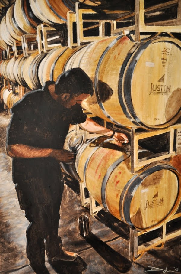
Here is my new painting, showing a scene from a trip my wife and I took to California wine country. Here, someone is taking a barrel sample from a barrel deep in a wine cave. The painting is in oil on a 24 x 36 inch canvas.
Here are the notes I've taken as I've painted it:
For session one, I started on the under-painting. I began laying in the dark areas with a mixture of transparent oxide brown and ultramarine blue. My goal is to lay in the under-painting with transparent pigments, and then move in with opaques.
For session two, I worked on two things, the barrels and the figure. For the barrels, I used a mixture of transparent gold ochre, raw sienna, and transparent oxide brown. I mixed that with my mixture of ultramarine blue and transparent oxide brown for the shadow areas. For the figure, I used terra rosa and transparent oxide brown for the flesh areas, mixed with my mixture of transparent oxide brown and ultramarine blue for the areas in shadow. I really struggled with the face. In fact, all the flesh tones will have to be revisited when I move in with opaques.
With session three, I started on the barrels going off into the distance. It was a real struggle to not put in too much fine detail. In addition, I started on the concrete floor. Again, all the pigments used were transparent.
Sessions four and five: barrels, barrels, and more barrels.
Session six and seven: I did not take a picture after session six. Basically, I finished the frame of the barrel structure. Session seven, I finished the under-painting and went in with targeted cool opaques. Mostly, that was a mixture titanium white and ultramarine blue. I'm finding that I use less and less opaques and spend more time on the under-painting with transparents.
I think it might be finished. I'm going to sit on it a week and see.
Here are links to images showing each painting session:
Session 1
Session 2
Session 3
Session 4
Session 5
Session 6 and 7
Final
For session one, I started on the under-painting. I began laying in the dark areas with a mixture of transparent oxide brown and ultramarine blue. My goal is to lay in the under-painting with transparent pigments, and then move in with opaques.
For session two, I worked on two things, the barrels and the figure. For the barrels, I used a mixture of transparent gold ochre, raw sienna, and transparent oxide brown. I mixed that with my mixture of ultramarine blue and transparent oxide brown for the shadow areas. For the figure, I used terra rosa and transparent oxide brown for the flesh areas, mixed with my mixture of transparent oxide brown and ultramarine blue for the areas in shadow. I really struggled with the face. In fact, all the flesh tones will have to be revisited when I move in with opaques.
With session three, I started on the barrels going off into the distance. It was a real struggle to not put in too much fine detail. In addition, I started on the concrete floor. Again, all the pigments used were transparent.
Sessions four and five: barrels, barrels, and more barrels.
Session six and seven: I did not take a picture after session six. Basically, I finished the frame of the barrel structure. Session seven, I finished the under-painting and went in with targeted cool opaques. Mostly, that was a mixture titanium white and ultramarine blue. I'm finding that I use less and less opaques and spend more time on the under-painting with transparents.
I think it might be finished. I'm going to sit on it a week and see.
Here are links to images showing each painting session:
Session 1
Session 2
Session 3
Session 4
Session 5
Session 6 and 7
Final
Thursday, August 16, 2012
Friday, August 10, 2012
"Vintage"
This is my latest painting. It is a landscape depicting a vineyard. It is in oil, on a 24 x 18 inch canvas.
Here are the notes I've taken while painting it:
For session one, I laid in the actual vines of the vineyard. I tried to indicate rows, and showed the perspective as they went into the distance up the hill. I used sap green, naples yellow, transparent oxide brown, permanent green medium, titanium white, and a touch of cadmium yellow light. Oh, I also used van dyke brown for the dark areas.
For session two, I added some darks: the trees in the distance, and plants in the foreground. In both cases, I used a mix of van dyke brown and terra verte. I'm hoping that when I add the yellows for the sky that the highlights on the distant trees do not look out of place.
Session three, I did two things: the sky and some of the foreground. For the sky, I wanted a warm yellow gradient from top to bottom. There, I used titanium white mostly mixed with slight traces of Naples yellow, cadmium yellow light, cadmium red medium, and ultramarine blue. I added patches of each one, and then blended with a dry brush.
For the foreground -- the red flowers -- I used a combination of van dyke brown and cadmium red medium. There I used both a brush and a palette knife to add thick chunky paint.
During Session 4, I really struggled with bush in the foreground. I added paint, scraped it off, added paint, scraped it off, and so on. I finally got it to a point that I'm resigned to. One thing that did go well, however, is closing up some of the big gaps on the trees in the background.
Below are the photos I've taken showing progress over time:
Session 1
Session 2
Session 3
Session 4
Final
Here are the notes I've taken while painting it:
For session one, I laid in the actual vines of the vineyard. I tried to indicate rows, and showed the perspective as they went into the distance up the hill. I used sap green, naples yellow, transparent oxide brown, permanent green medium, titanium white, and a touch of cadmium yellow light. Oh, I also used van dyke brown for the dark areas.
For session two, I added some darks: the trees in the distance, and plants in the foreground. In both cases, I used a mix of van dyke brown and terra verte. I'm hoping that when I add the yellows for the sky that the highlights on the distant trees do not look out of place.
Session three, I did two things: the sky and some of the foreground. For the sky, I wanted a warm yellow gradient from top to bottom. There, I used titanium white mostly mixed with slight traces of Naples yellow, cadmium yellow light, cadmium red medium, and ultramarine blue. I added patches of each one, and then blended with a dry brush.
For the foreground -- the red flowers -- I used a combination of van dyke brown and cadmium red medium. There I used both a brush and a palette knife to add thick chunky paint.
During Session 4, I really struggled with bush in the foreground. I added paint, scraped it off, added paint, scraped it off, and so on. I finally got it to a point that I'm resigned to. One thing that did go well, however, is closing up some of the big gaps on the trees in the background.
Below are the photos I've taken showing progress over time:
Session 1
Session 2
Session 3
Session 4
Final
Subscribe to:
Posts (Atom)